

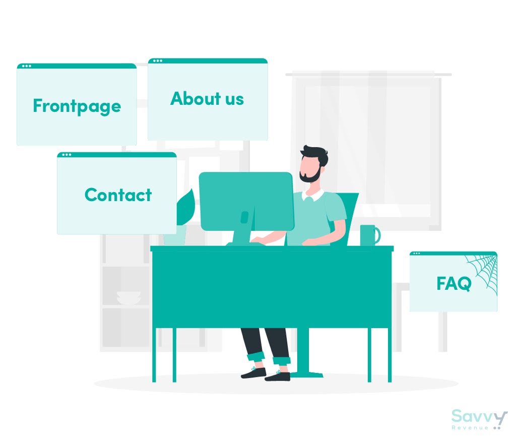
When you think about ranking website pages in terms of importance, what comes to mind?
The homepage? The about page? Definitely the contact page, right?
You’re not wrong about those being important pages, but there’s certainly more to a website than just telling potential customers who you are, what you offer, what you do, or how to reach you.
One of the unsung heroes of a website is the FAQ page. It’s on the FAQ page where you can answer some of your customers’ most burning questions, or maybe answer questions they didn’t even realize they had.
But an FAQ page isn’t just about answering the major questions; it’s about overcoming customer objections (or fears).
In other words, an FAQ page can help you close the deal. It can be the final push for customers to make a purchase. The FAQ page is part of your customer service efforts. If your team hears a question or complaint from one customer, it’s safe to assume there are several other customers who are thinking the same thing.
And if you aren’t doing everything you can to address those concerns or questions, it could be costing you more than you think. In fact, according to New Voice Media, the top reason why customers switch to a different brand is because of poor customer service.
So how can you create a high-converting FAQ page? Well, you’ve come to the right corner of the internet.
In this article, we’re taking a closer look at what makes for a high-converting FAQ page, how you can tell if yours sucks, and a few examples of great FAQ pages.
What makes an FAQ page high-converting?
Before we launch into the nitty-gritty details about how you can improve your existing FAQ page or create a killer one from scratch, we need to get the basics down. If done incorrectly, an FAQ page can actually be the reason why your customers end up not converting.
All great FAQ pages have one thing in common: they answer your customers burning questions.
But you already knew that.
What else?
It includes the right questions
This may seem obvious, but it’s worth covering. If you aren’t answering your potential customers’ questions, you’ve got a big problem on your hands.
The FAQ page is not the place for your company’s history, or to list how many employees you have. Your FAQ page should house the questions your customers are leaning on to make a decision.
In other words, if you’re not asking the right questions, you could be sending your customers running for the hills.
So what exactly are the “right” questions?
FAQ questions could be about sizing, shipping, returns, fees, discounts, and other relevant topics. They could also be regarding any nuances to your product that customers might not know unless you bring up initially like special sizing, a unique return policy, etc.
Put yourself in your customers’ shoes for a minute…what questions would you have? What information is essential for you to convert?
It’s organized and easy to navigate
The absolutely last thing you want is to overwhelm your customers after they land on your FAQ page. It’s just the opposite of what you want them to do.
To safeguard against confusing them, a little organization goes a long way.
There are several ways you can organize the page—like topic or category. This breaks up the page and makes for easier searching. The less time your customers or prospects have to spend on trying to find the answer to their question, the better (for both of you).
Also, it’s important to make the page easy to find on your website. If your customers can’t find the page in the first place, how can you expect them to find it helpful? Include two or three relevant questions on relevant product pages, and be sure to link to the page on the footer of your site and in other areas like your about, contact, and help sections.
Lastly, from an organization and user-experience perspective, make the FAQ page searchable. Adding a search bar on the page is a great way to help customers find what they’re looking for faster. It can also be a great opportunity to direct them to other resources on your site, like a blog post that further explains the topic they want to learn more about.
The moral of the story: don’t overwhelm customers with too much. Too many questions can trigger overwhelm, which can lead to them navigating off your site completely. Keep things simple. Just be sure to direct them to your customer service team in case they have more questions.
It’s written in terms your customers can understand
As I said above, the last thing you want is to overwhelm your customers with a “solution” that is less than helpful. When writing your FAQ page, make sure it’s not full of technical language or long-winded answers—unless it’s totally warranted. Keep the language on-brand, but easy for your customers to understand.
Your customers don’t want to spend tons of time deciphering the FAQ answers. They want to go ahead with their purchase and move on with their lives.
Don’t be afraid to go the video route, too, if need be. Use Loom or another screen recording tool to create a quick webcam video of someone explaining a problem with a visual aid.
It offers additional help
Though FAQ pages are extremely helpful, some questions can’t be completely answered in a question-and-answer format. They’re either too complicated or too technical.
If one of your questions requires additional explanation, make sure you direct your customers to the page or customer help line where they can do just that.
For example, BBQGuys does a great job of this in their FAQ page.
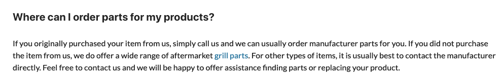
Under the question, “Where can I order parts for my products?” users are given a straightforward answer, but also have the opportunity to shop BBQGuys’ items or contact them for help. The answer offers several solutions for the customer or prospect, which increases the likelihood of action from them.
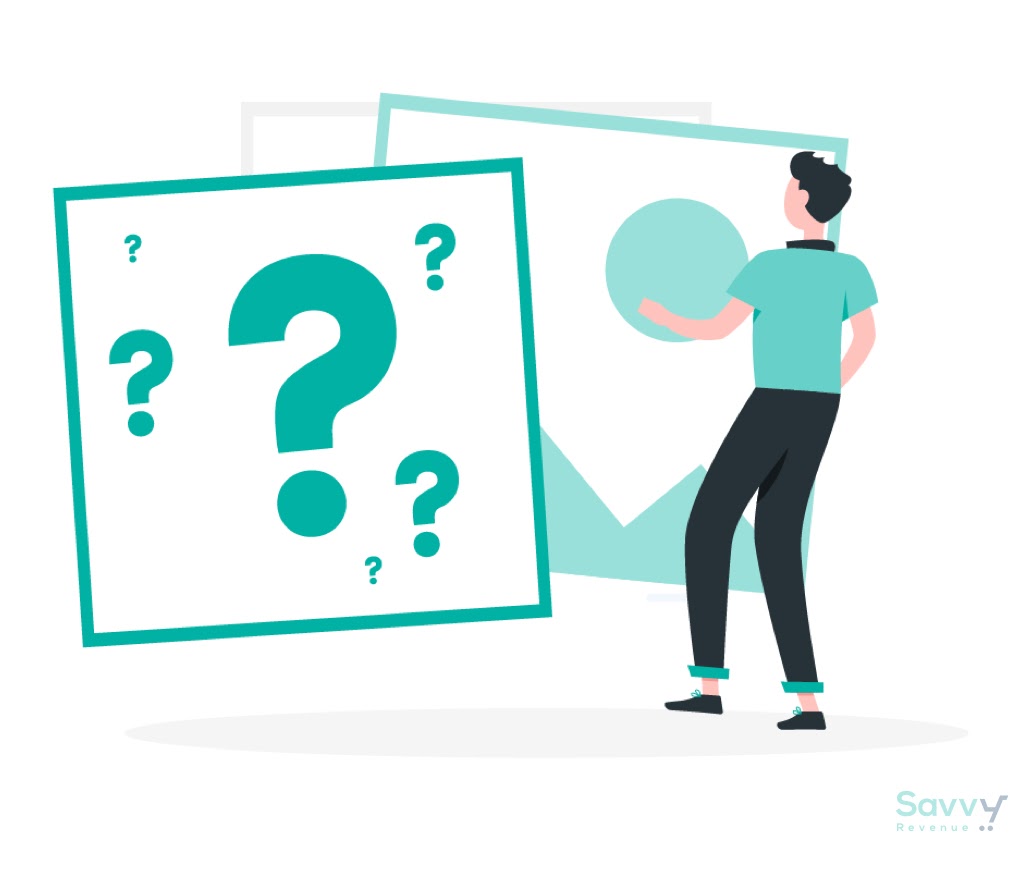
How can you optimize your FAQ page?
Now that we know what a killer FAQ page looks like, how can you be sure yours isn’t missing the mark?
Depending on your current FAQ page, there are several things you can do to make it better. But before you start changing things, there are a few things you should do first.
Audit your current FAQ page
Like with anything on the internet, if you want to really understand how something is performing or where improvements could be made, start with an audit.
Take a look at your FAQ page from both the customer perspective and your perspective. Run through the page as if you were a customer (or better yet, have someone else do this for you and see how they fair) and take note of any obstacles, errors, or UX issues. This allows you to get a firsthand look at how your users are interacting with the page so you can implement changes that are actually going to benefit from them (and benefit you, too).
Then, run through the page yourself. Are you answering the most common customer questions? Are there broken links or design issues that need to be fixed ASAP?
It’s easy to just put up a FAQ page and let it be, but doing a deeper dive can help you filter out any glaring issues (as well as a few smaller ones).
A/B test your new FAQ page
You’ve audited the page and made a few changes. So you’re good now, right? Not so fast.
To measure the effectiveness of the changes you made, try A/B testing your FAQ page. Here’s a quick rundown of how to accurately A/B test your FAQ page:
- Decide what variable you want to test (remember to focus on just one).
- Determine the goal of the test (what specifically is the goal of testing this variable?).
- Launch your test.
- Gather data until its statistically significant.
- Analyze your findings.
You may find out that the thing on your site you thought was broken is actually not the problem, but something else is.
A/B test your FAQ page until it’s as good as gold. Your customers (and your bottom line) will thank you.
Listen to your customers and prospects
So, you’ve audited your FAQ page and you’ve been running several A/B tests to make sure it’s as great as it can be. But none of that means much unless you’re listening to your customers and prospects.
You can learn a lot about your customer experience through—you guessed it—your customer service channels like live chat, email, social media, and surveys. Pay close attention to what your customers are saying; are they having trouble finding the FAQ page? Are they confused about sizing or shipping? Find the common threads in customer feedback and let that guide the changes you make to your page.
Then, once you build your new page, you have to make sure it will convert.
4 FAQ page examples that deserve a round of applause
Let’s take a look at some of the best FAQ page examples we’ve seen.
Allbirds
Allbirds, a men’s and women’s shoe brand known for their stylish, wool shoes, has an FAQ page worth taking a page from. To start, the page is easy to find (located in the footer of the homepage).
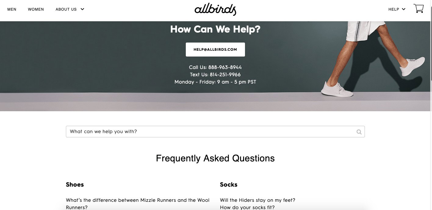
Once users click on the page, they immediately see alternative contact information for their customer service team. The FAQ page itself is organized by category (and includes some of the most common questions under each so as to not overwhelm customers), and it also includes the important search bar.
The Allbirds FAQ includes a variety of questions from things like “How do Allbirds fit?” to “Can I expedite my order?”. When customers click on a question, they’re taken to another page that includes a simple response to the question.
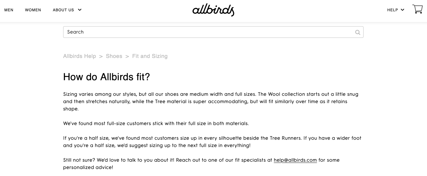
Because Allbirds shoes are unique from other shoes, they also include information about sizing, fit, and the difference between different styles.
Overall, the page is easy to navigate and use, and makes it simple for customers to find what they’re looking for either within the FAQ answers or from a customer service rep.
Etsy
I’m a big fan of Etsy’s FAQ page for several reasons.
The first being that because Esty is both a buyers and sellers platform, they understand that these two distinct audiences will have different questions. The FAQ page is broken up into “Shopping on Etsy” and “Selling on Etsy” categories, so users don’t have to spend time combing through questions that may not be relevant to them from the start.
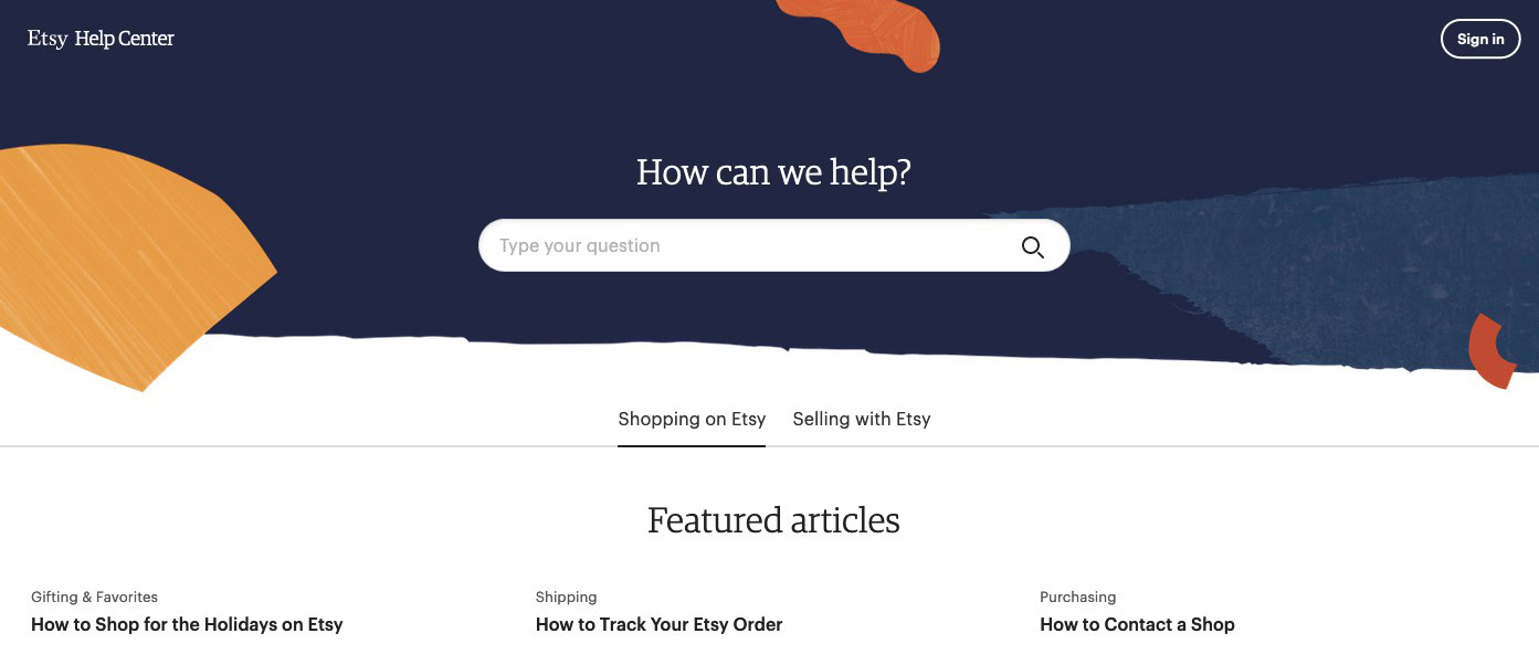
Just below that, Etsy includes a “Featured Articles” section where they highlight articles that their users visit frequently when trying to learn more about Etsy or solve an issue they’re having with the platform.
It’s more or less a list of their common questions, but instead of crowding the page with long answers, customers are taken to a new page once they click. If a customer still hasn’t found what they’re looking for, the page also includes another section that’s organized by category to help them along.
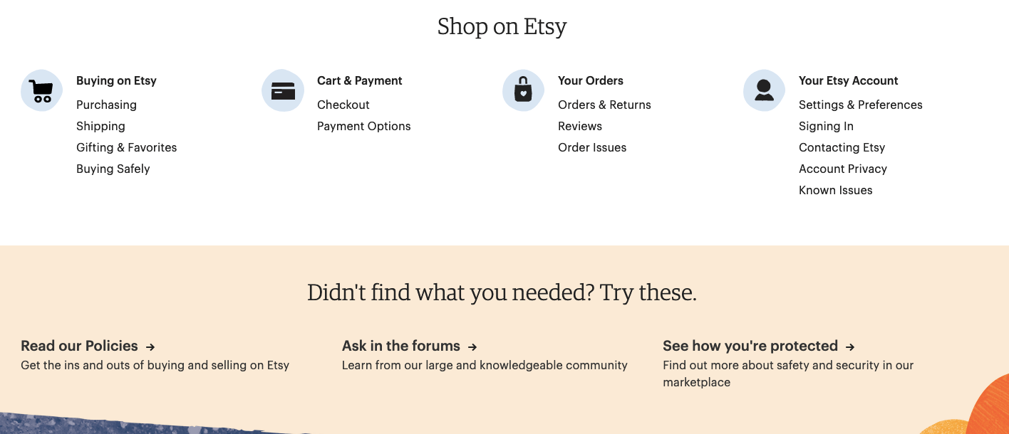
Then, as a final resort, Etsy offers customers the chance to connect with their customer service team if they a) still haven’t found the answer to their question or b) if they’d prefer to find their solution via customer service team.
BBQGuys
BBQGuys is a one-stop-shop for all things BBQ. From smokers and grills to cookware and thermometers, you’ll find it here. BBQGuys’ FAQ page is more streamlined than the other two, but it’s just as impactful in my opinion.
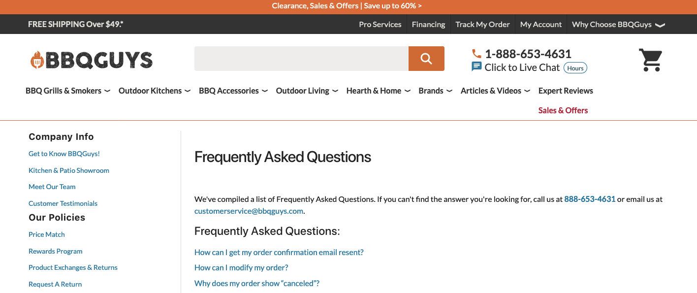
At the top of the page, BBQGuys offers customers a phone number and an email address they can use to contact their customer service team if they’d rather seek help that way.
Then, they list the most common questions from customers in a “page-jump” format. It’s not as fancy as other FAQ pages, but it doesn’t need to be. More often than not, straight-to-the-point wins over “too helpful.”
Purple Mattress
First of all, I love how Purple used the line “Purple supports” instead of the popular “How can we help you?” It’s a play on their supportive, yet comfortable mattresses, and the FAQ page. Clever.
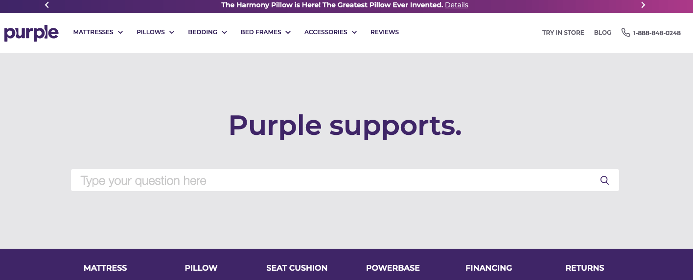
Purple’s FAQ is pretty simple from a design perspective, but it makes it easy for customers to find what they’re looking for. When a customer begins to type a question into the search bar, they’re met with several article suggestions underneath.
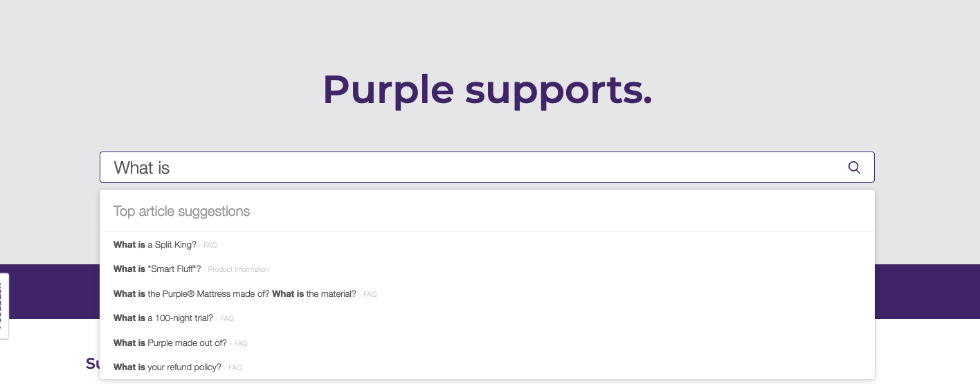
This is great for two reasons:
- First, it can help lead customers in the right direction even if they aren’t sure how to word their problem.
- Second, it provides them with suggested reading related to the topic.
Then, underneath the search bar are categories that are presumably the most popular.
What’s great about this FAQ page is that in addition to providing several opportunities for customers to find what they’re looking for, they also explicitly spell out their customer care hours as well as their physical store location hours.
Providing customers with the relevant information they need is key to a successful FAQ page.
A thought-out, strategic FAQ page goes a long way
FAQ pages aren’t just a place where the answers to your business’ most common questions live. They play a role in the customer journey, and in some cases, it could make or break a conversion.
A strong FAQ page will be strategically planned and designed to help the customer, instead of serving as a place you simply direct customers to go to find what they’re looking for.
Want more articles like this? Sign up for our email newsletter and never miss an article.
")
")
")
")
")
")